Conducting user research and creating design solutions to optimize the experience of shopping for skincare
Three Ships Beauty Internship
Overview
In the summer of 2021, I had the opportunity to work for a skincare startup based in Toronto. As the sole designer, I was responsible for conducting user interviews and strategizing ways to increase user acquisition.
Timeline
May - August 2021
Team
Lillie Sun
Joanne Kim (me)
My role
User research, high fidelity mockups, moderated usability tests
01 DEFINE
Defining my Scope
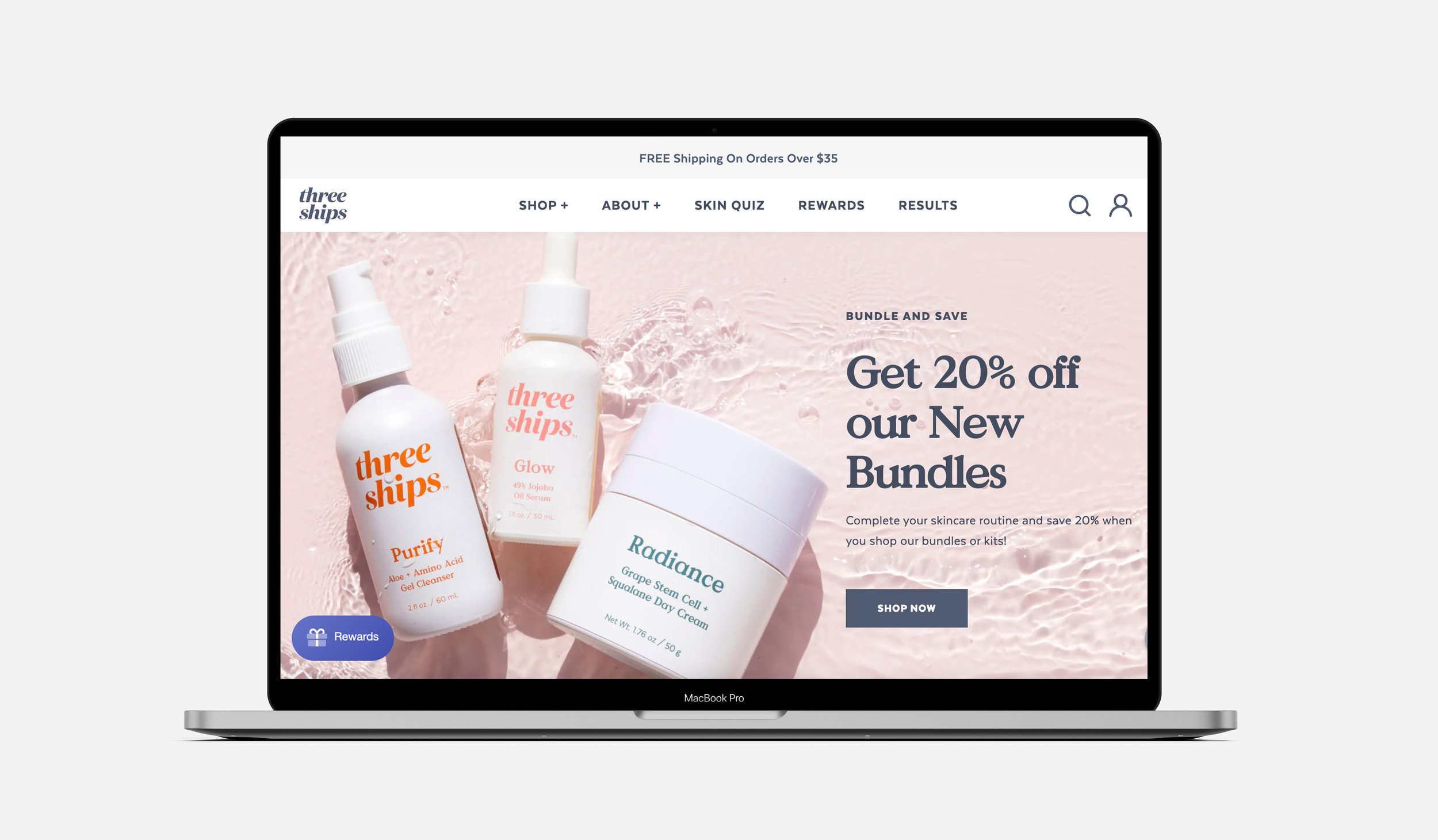
Three Ships Beauty is an e-commerce skincare startup that has grown rapidly in the last 4 years in business. As a Canadian DTC brand trying to increase more US awareness, I was tasked to conduct user research in order to enhance the user experience of browsing on our website and identify user pain points.
The primary goals of this research is to:
Understand the pain points in the user journey of a Three Ships customer ->
Where and why are customers abandoning their carts?
Address pain points with tailored design solutions
A Starting Point
When I analyzed customer shopping behaviours on Google Analytics, I found out that almost 50% of users abandon their carts and almost 60% of users abandon their carts at check-out.
Although studies have shown that on average, 75% of customers leave e-commerce websites without completing their purchases, I knew that there was room for improvement - and I was determined to learn which pain points trigger users to abandon their carts.

02 RESEARCH
Competitive Analysis
I kickstarted my research by doing a thorough analysis of 4 competitor websites. I specifically decided to research these skincare brands, as they have similar brand values and coexist in the natural and sustainability-driven space in the skincare industry. Through this audit, my goals were to understand current trends and assess the features that are similar to the ones on our website.
Finding a sweet balance of displaying enough information is hard.
Our competitors either have too much information on their products (making it hard to read) or insufficient information (not helpful enough) in the PDP.

Key takeaways
Many of our competitors have very informative product detail pages, but a good chunk of information is typically crammed in the PDP, overwhelming to read through
If the competitor’s PDP is easy to digest, it often lacks relevant information such as when and with what other products it should be used.
The amount of information on our competitor PDPs is overwhelming to read.
In Youth to the People’s skincare website, information not displayed in digestible pieces
Chunks of information about ingredients, tips and how to use products are crammed in the Product detail page with no visual aid

Unpacking User Stories
I ran a user survey to better understand the current user journey for customers and identify pain points that may hinder their shopping experience on the Three Ships website. I created an online questionnaire to collect qualitative data from our target users which included 213 female users ages 20-40.
By synthesizing the insightful feedback into high-level themes, I was able to identify the most common frustrations users faced while shopping on our website.

Diving Deeper
In order to gain a more in-depth and thorough perspective on the user stories, I decided to recruit 7 Three Ships customers to conduct moderated usability tests of our website.
“I want more information about how the products work together, what order to use them in, which ones work well together”
-Three Ships Beauty Customer [female, 35]
The Current User Journey
In the ‘interaction’ phase of the current user journey, many users struggle to find 2-3 products to buy to qualify for free shipping due to:
1- Out of stock issues of our best-seller items
2- A lack of relevant information in the PDP like which product is best suited for their skin concerns

When customers reach the ‘consider’ stage, many are abandoning their carts because they don’t qualify for shipping with only 1 product in their cart.
The lack of information on when & how to use the product, products suited for their skin type and out of stock items are preventing customers from committing to our products.
02 PROBLEM SPACE
Shipping Fees are a Waste
My biggest takeaway from my qualitative research is that for many customers, shipping costs are deemed as an ‘a waste of money’ and they much prefer finding multiple products to purchase at once to avoid shipping fees. However, customers are struggling to commit to our products and checkout because they aren’t finding the information they need on our PDP. Unfortunately this issue is further exacerbated by the out of stock issues our company is facing due to COVID-19 shipping delays.

If customers don’t find 2-3 products to buy, they’re likely not going to purchase at all.
Shopify analytics support the evidence that customers hold off their purchase if they don't meet the free shipping threshold of $50- if they don't find 2-3 products to buy, they are likely not going to purchase at all.
“Sometimes when I realize the shipping charge I decide to hold off on my order until I need more products (to make the shipping cost worth it)” [Three Ships customer, female]

Why are customers struggling to meet the free shipping threshold?
1- Lack of guidance on making purchasing decisions
My research findings indicate that the current PDP overflows with information about the ingredients, but it doesn't detail any instructions on how to layer which product in what sequence.
“It’s difficult to find specific information when comparing items. For example finding info on the order of products and advice on a serum” [Three Ships customer, female]

2- Too many out of stock items
One of the key insights from my survey is that people hold off their purchases if the items they are looking for are out of stock. This is especially a bigger issue for a smaller company like Three Ships because we don't have a selection of products unlike major retailers and a lot of our product pages only have a handful of products (2-6).
“When I'm looking to purchase products normally one is in stock that I'm looking for and the other is not. Therefore, I do not order because I don't want to pay the shipping” [Three Ships customer, female]
In the "cream" collections page where the only product in display is out of stock, customers are faced with a blank page
This is equivalent to an empty shelf in a physical store - a common drop-off point on the site.
3- An inconvenient navigation system
During the user interviews, customers mentioned that there is an inconvenient navigation system and that it's hard to go back and forth between product pages. The combination of an inconvenient navigation system and out of stock items is creating a frustrating experience for many customers - reducing the time they spend on our website.
“I found it difficult to go back and look at something. I always had to re-start my search for a product using the tab at the top” [Three Ships customer, female]

User Persona
Based on the insights gathered from the user survey and usability test, I created a user persona which reflects our customers' needs, frustrations and goals. The lack of information and out-of-stock products are the primary pain points Lisa has.

How might we curate an intuitive shopping experience that helps customers make informed purchasing decisions?
03 DESIGN RECOMMENDATIONS
Addressing customer pain points & brainstorming ways to design a more curated shopping experience.
In order to address the most prevalent pain point which is the fact that there's an overall lack of information on how to use our products which takes away the customers' opportunities to make informed shopping decisions, I brainstormed ways to create a more curated shopping experience.

1- Helping customers make informed purchasing decisions
Before handing off my research insights and recommendations to the Lustre design agency, I emphasized that there’s a lack of information on our products -like when / how to use it and where the product fits in their existing skincare regimen. We brainstormed ways to help users visualize information about our products in a concise way -without making them read up on paragraphs of information by customizing a little product guide in each PDP.
2- Designing a more flexible navigation system
Although internal shipping delays, resulting in out of stock items are out of my scope, I wanted to brainstorm ways to create intuitive shopping experiences, even when the only product in the collections page is out of stock. Currently, when an item is out of stock in the products page, the user has to go back to the navigation bar and go through a tedious process of selecting another page to navigate to - requiring multiple steps. I wanted to facilitate the navigation process to ensure that customers can easily navigate back and forth between collections pages instead of dropping off. By adding a sub navigation bar, users have more flexibility to go between pages, extending their browsing time.

3- Labelling each step
This hover section explains what step of the skincare routine the products displayed belong in and differentiates the products within the page as not all serums are the same (i.e. explains the difference between water-based and oil-based serums and when they should be applied for optimal results in a skincare regimen). The products pages is the ideal spot to explain that not all serums are the same because information should be broken up into digestible pieces so that customers are not overwhelmed with paragraphs after paragraphs of information in the PDP.

Reflection
Finding the sweet spot
Since I am a #skintellect myself, I had this bias that skincare was an intuitive thing for everyone. Although heavy loads of information crammed in the PDP is overwhelming, most customers I interviewed wanted to learn more about skincare and see relevant information that will help them commit to the product because they weren’t #skintellects. This is why finding the sweet spot; presenting information such as when and how to use the product through visualizations and in an easy-to-digest format is key to reduce the user’s cognitive load.